NVPAS Library
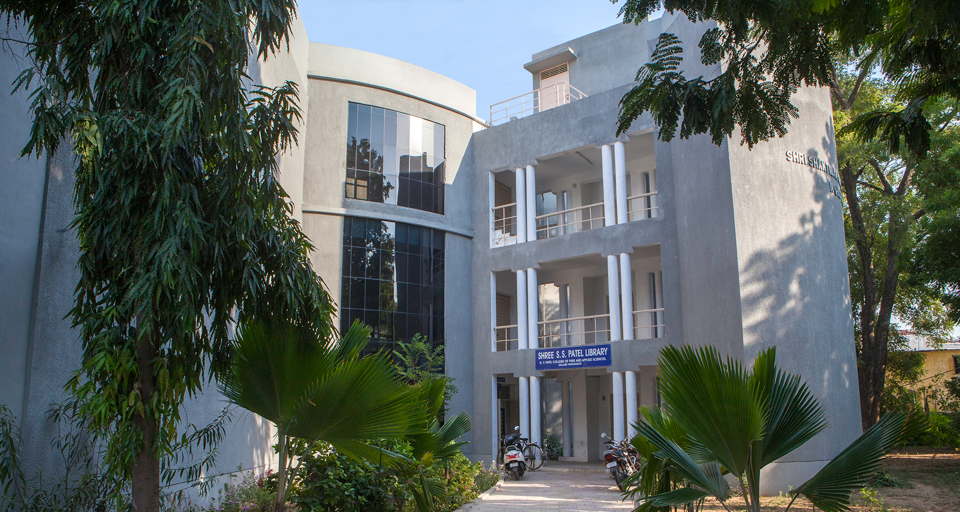
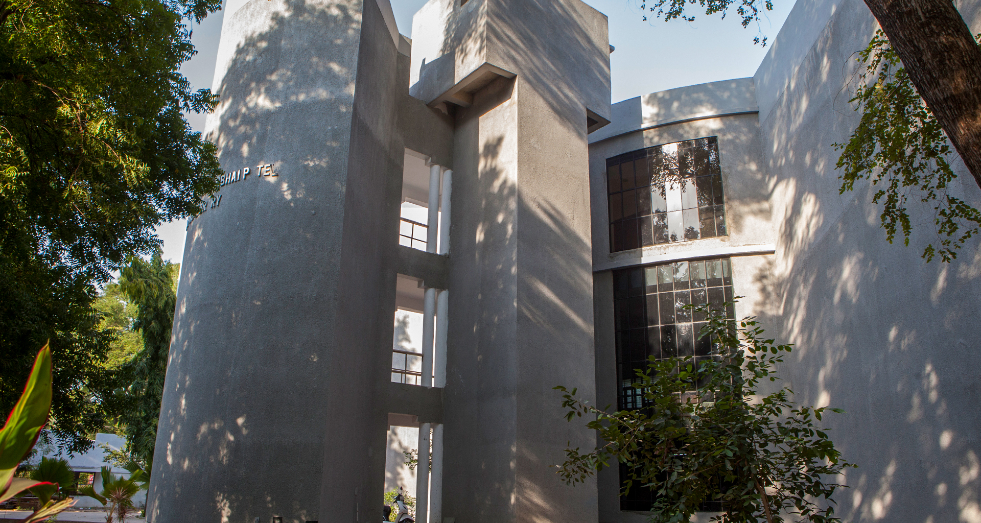
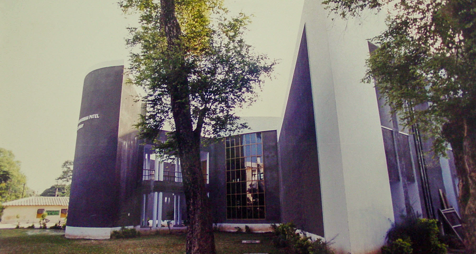
The dead walls and the sharp slanting edges of the building stand boldly, forcing an ambience of silence within the structure
Featured in 2001 July Issue of ‘Indian Architect & Builder’ under the title ‘Articulating Design’ along with works of Frank-O-Gehry and Zaha Hadid
One of India’s largest educational campuses was looking for a separate library building for the science college across the busy road in the botanical garden. We had two challenges to save as many trees as possible and to have a silent zone reading. The dead walls and the sharp slanting edges of the building stand boldly, forcing an ambiance of silence within the structure. The double-height glass facade accentuates the solidity of the acute angles. Also, the landscape layout of the building retained the rare trees around it. The library building comprises two triangles interlocked with each other by a smooth curve. The plan being symmetrical, the entry is through the central axis. This kind of simplicity and sharp geometry is reflected in many of our projects. The plan of the library building is like an open book, inviting students inside and engulfing them with the fluid movement of spaces as the building speaks for itself.
On entering the building through a narrow corridor, one gets transported into a central atrium with a beautifully patterned ceiling, thus creating a kind of surprise for the visitor. The library building has been designed in such a way that it allows maximum light around the year. The orientation of the main spaces, shaded by two huge blank walls, minimizes distraction from the road. The corners have been intelligently handled by placing services and the librarian's office on the ground floor. Keeping student activity in mind, the architect incorporated a multipurpose hall on the upper level of the building overlooking the hall below and an open terrace in the rear. The corners have been used for the services and storeroom. The staircase is consciously kept on the outside so that reading is undisturbed. As a climatic response, the larger surfaces are on the west, cutting off radiation along with noise. This building does not imitate but creates its own identity to fit in the campus.
+
- Completion Year : 1998
- Client : Charotar Vidhya Mandal
- Area : 20900 Sq.ft
- Location : Vallabh Vidhyanagar, Anand
- Team : Kamal Patel, Nelson Machwan, Ami Shukla, Sumant Patel, Vashrambhai P, Rajiv Bhatt


